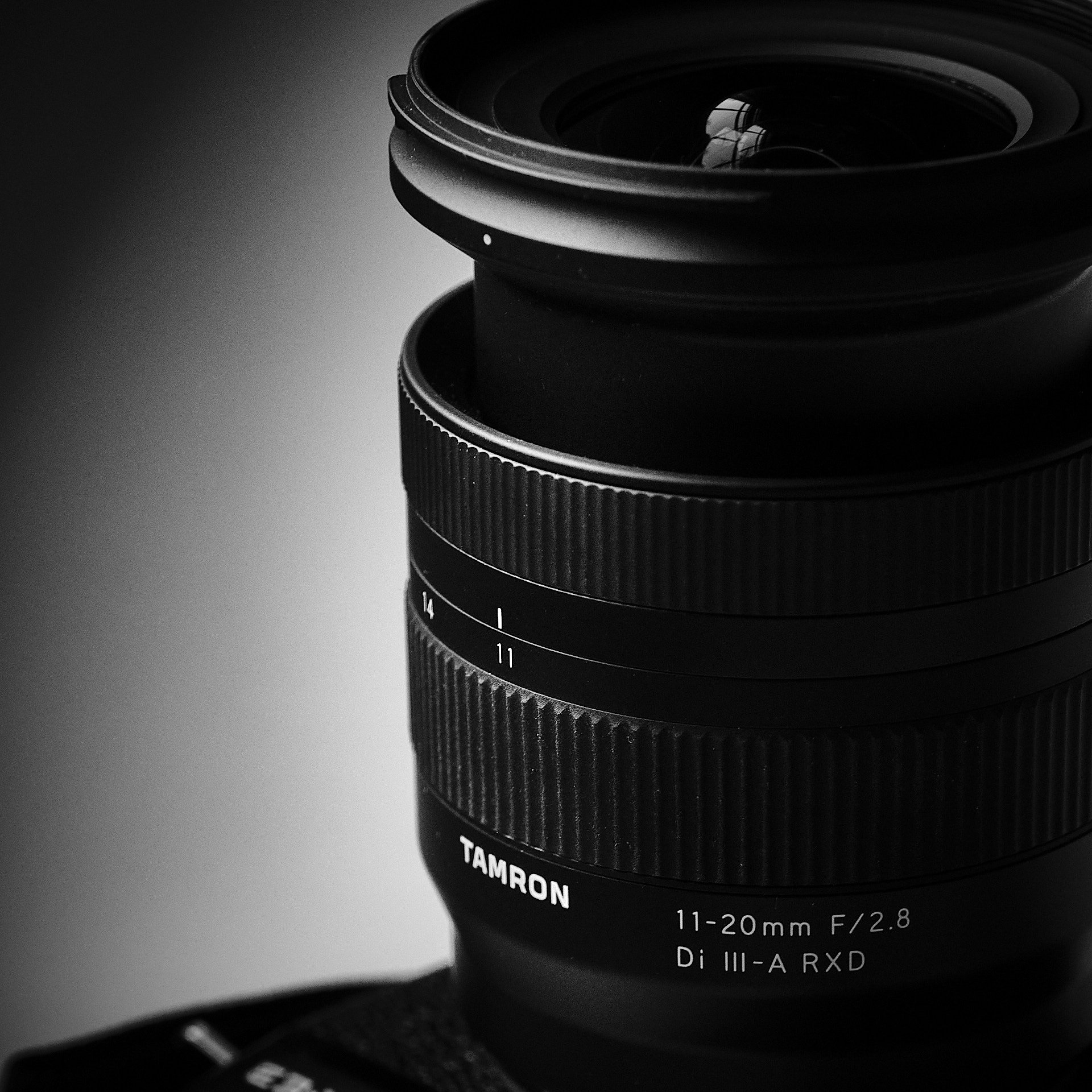
Gear review: Tamron 11-20mm lens
A hands-on review of the Tamron 11-20mm f/2.8 lens for Fuji X-mount, based on using it for landscape photography in Iceland.
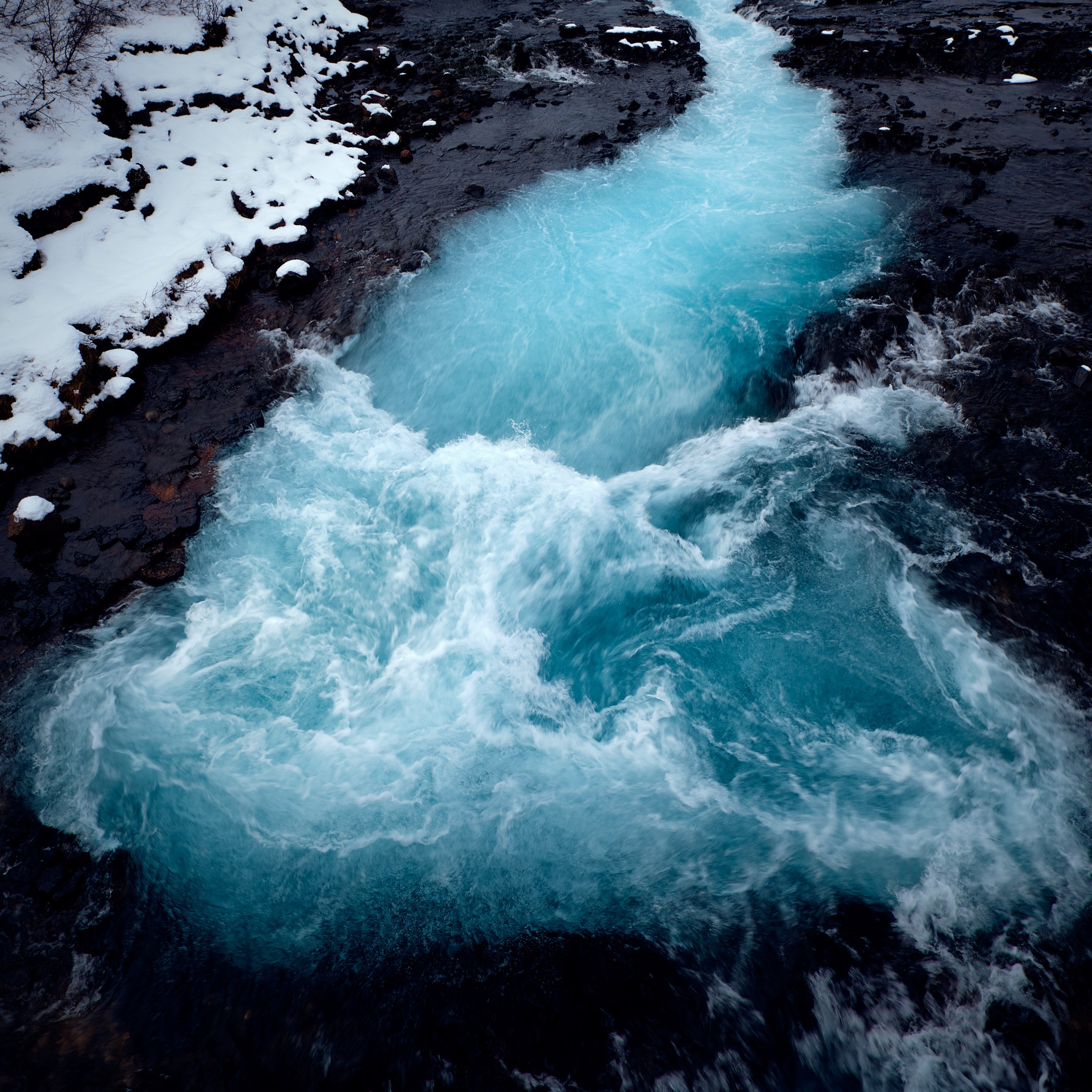
Iceland Photos Part III: Waterfalls
Iceland is a land of spectacular waterfalls, and we visited many during our week long workshop.

Iceland Photos, Part II: Búdakirkja Black Church
The iconic black church at Búdakirkja, seen both in sunlight and in snow.
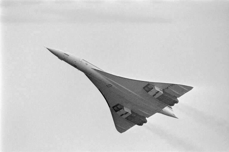
Watching an eclipse…from a Concorde
Why just stand in one spot to look at an eclipse when there’s a supersonic, high altitude plane that can make it so much better?

Iceland Photos, Part I
Images from the first couple of days of the landscape photography workshop I took in Iceland, including spectacular Kirkjufell mountain.
I’m not on Facebook much anymore, and I cancelled my Twitter account. So if you want to save yourself the trouble of bookmarking this site, or using an RSS reader, I can send you a brief email periodically after I’ve put some posts up.